PROJECTS
RICE
REBRANDING RICE CREW
After becoming the Marketing & Design Chair for RICE (Rochester International Choreography and Entertainment) Crew, a Rochester-based dance cover and hip-hop team, I took on revamping the logo and social media pages as they were outdated, engagement was low, and we weren’t very well known as a dance group. Brainstormed multiple different drafts, designs, and identified elements unique to our dance crew to give it an identity it had lacked prior.

01
Before
No brand identity
Generic and low quality logos and designs
Low follower count and engagement


02
Research
Important elements:
East Asian influences
Dance keywords: kpop, modern, hip-hop, art
RICE bowl (RICE = Rochester International Choreography & Entertainment)
Youthful but not childish, young adult group
03
Goal
As a performing arts group, RICE Crew strived to have a modern feel that emulated the youth of our team but maintain a sense of professionalism.
Incorporating elements of the group's East Asian influences was essential.


04
Objectives
Open & welcome
Passion for our art
Trendy
Elevated style and skill
05
Keywords
Modern
Sleek
Contemporary
Flow
06
Key Elements
Rounded/wavy linework
Waves
Gradients
Rice bowl
Circular elements
results:
Keep the blue and white color palette, but added black for a sleeker look.

07
Color Psychology
Goals to convey:
Open & welcome
Passion for our art
Trendy
Elevated style and skill
Blue
Reliability
Open spaces
Freedom
Imagination
Inspiration
White
Efficiency
Trustworthy
Honesty
Cleanliness
New Beginnings
Black
Professional
Responsibility
Confidence
Durability
Discipline
08
Water
A new wave: new logo
Refreshing: we’re bringing something new to the table, we’re the only Asian dance crew on campus
Water is constantly flowing and moving with grace, perfect for a dance group
Openness: we welcome all and can fill all possibilities/expectations
Everchanging: constantly evolving and changing with the times, just like our new brand image
Wave inspired by Japanese print The Great Wave off Kanagawa to reference our ties to East Asian culture
Rounded lines, wavy lines, dots/circles tie into water imagery (roundness)
Gradients in the rice bowl on the logo that mimic waves
Although we wanted professionalism, we still wanted to be inviting to new members


09
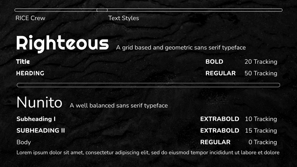
Fonts
Righteous: A geometric sans serif typeface for titles and headers. Visually accessible with the perfect balance of lines and curves. It was modern and sleek and complemented the rice bowl we made well.
Nunito: For body text and subheaders, rounded sans serif typeface with good balance.
results:
RICE Crew's Instagram rose from mid-300s (2018-2022) to over 1000 followers in less than 4 months.
Instagram engagement increased by 41,000% within 3 months and increased follower count by 310%.
From 2021-2022 RICE Crew was invited to perform at 4 events → since rebranding and focusing on social media promotion RICE Crew has had 4+ performance requests every month.
Partnered with local entertainment venues and restaurants to to headline performance events, host team dinners, and sponsored giveaways to social media followers.
Secured partnerships with local brands to sponsor our annual showcase.
Received requests to perform outside of Rochester and at both dance and non-dance events (Rochester middle/high schools, night clubs, state dance competitions, events at other universities.

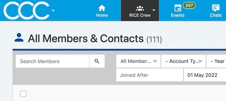
May 2022:
111 Members
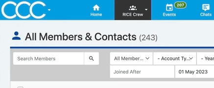
May 2023:
243
April 2024:
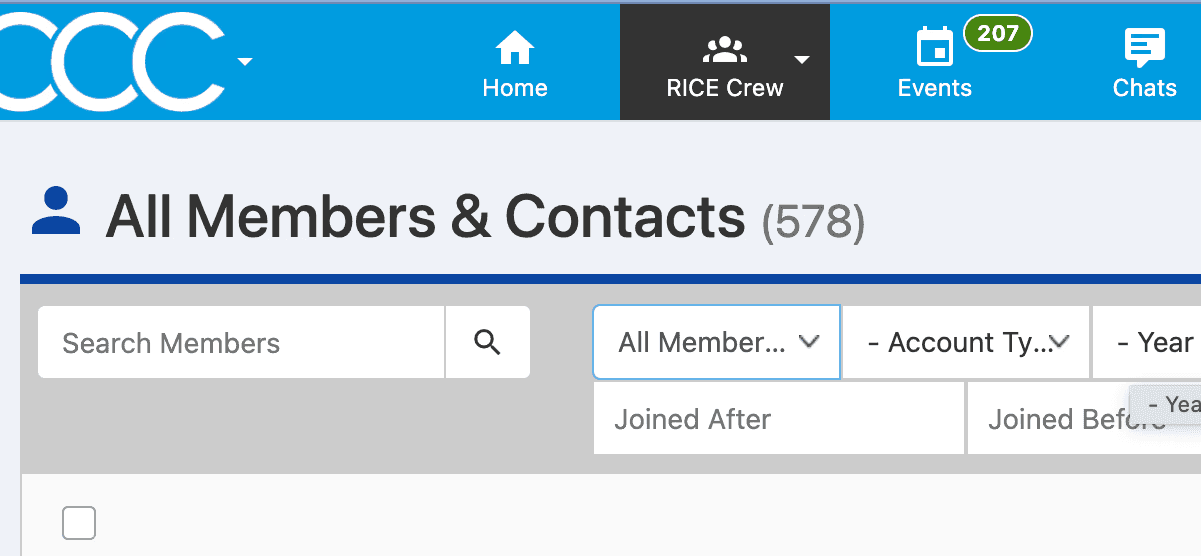
578 Members